Wednesday, March 24, 2021

A Very Specific and In-Depth Critique of Pokémon Brilliant Diamond & Shining Pearl's Art Design

Promotional art for Pokémon Brilliant Diamond and Shining Pearl, with the game's titles left and right under the legendary Pokémon Dialga and Palkia, respectively

[The following is the extended portion of the "I'm Into This - Pokémon Brilliant Diamond & Shining Pearl (...Kind Of)" segment published in the February 2021 issue of HOH Magazine. It's being published here in its unabridged entirety, not because it 'deserves to stand on its own' but because editor-in-chief David Hoh felt it was too long for the 'I'm Into This' segment.]

The announcement of remakes for the Generation IV games, Pokémon Diamond and Pokémon Pearl versions, were not unexpected. In fact, I'd been expecting them since the originals came to North America in 2007. We'd recently had Pokémon FireRed and LeafGreen, remakes of the original Gen I games; so even being amazed at D/P's graphical improvements on the Nintendo DS, the most cutting-edge Pokémon games yet...I knew in the back of my mind "They're gonna remake these some day." I just didn't know when it would be, or what it would look like.

Until now.

Screenshot of Jubilife City in the Brilliant Diamond & Shining Pearl Announcement Trailer - Tiny People
...and it looks like this.

Hmmmmmmmmmm. I'm sorry. Chalk it up to something I "Will Get Used To," but allow me to add to the "dislike" side of the aesthetic debate, that the Pokémon fan community got into the minute footage of these games premiered, as part of a Pokémon Direct presentation on the 25th anniversary of the original Pokémon debut.

The future is full of dull surprises.

Don't get it twisted: I will still buy and enjoy these games. It's important to criticize what you love, is all. Imagine the things you enjoy complexly. You're stronger and cooler when you can comfortably say something like "I really like what WandaVision was doing but the ending felt a little flat to me." It's well-rounded. Like these chibi-ass characters' heads in BD/SP.

Twitter user @JohnstoneYT tweets: "I just don't understand how people don't like the Brilliant Diamond/Shining Pearl character models. It's literally a 3D version of the 2D art" with side-by-side pictures of 3D tiny Lucas and 2D Lucas's overworld Sprite

I guess I'll just start breaking it down. Johnstone makes a fair point, and while I respect the artistic decision from ILCA (who developed the game instead of Game Freak) to literally just translate the 2D art to a 3D format...that is exactly my whole entire problem with it. I think it's a lazy decision. And not to put the blame at ILCA's feet, but Game Freak has developed every other core series/remake Pokémon game so far, and they've all looked great. Simplistic deduction, but them's the facts. It's a fine decision, but it's lazy compared to every other remake.

Top and Bottom comparison of screenshots from Pokémon battles in (top) Omega Ruby/Alpha Sapphire and (bottom) Brilliant Diamond/Shining Pearl from the announcement trailer. @megaevolutions captions "Vast Battle Improvements" which, scenery-wise, is evidently true

Yes, random Instagram post, the in-battle footage looks really good. A truly revamped Sinnoh region experience, bringing the land to life in a bigger and better way. It looks like the Sword and Shield in-battle scenes. But the battle scenery always gets massive graphical expansions as the Gens went on.


Screenshot of Wild Lugia Appeared in Pokémon Silver Version
Screenshot of Wild Lugia Appeared in Pokémon SoulSilver Version

My gripe is expressly with the overworld look, which is where more than 50% of the gameplay will be spent. The Duplo player characters and NPCs I don't have an issue with, they're a little too chibi for my tastes, but that's okay. But they're indicative of the problem: they are walking around a 1:1 re-skin of the original graphics. Which is a big let-down! Sinnoh is a region of abundant landscape and bountiful biomes, and the other regions all received great graphical expansion in their remakes. Whereas BD/SP is giving us basically the same thing in 3D with a tilted angle:

Top & Bottom comparisons of Lake Verity from Pokémon Diamond and Pearl (top, captioned: "ORIGINAL") and Brilliant Diamond & Shining Pearl (bottom, captioned "REMAKE") Dawn and Professor Rowan are present in both, in the remake the perspective is wide enough to also see Lucas and Barry

Personally, I prefer the aesthetics of the sprite look of these two. The former was designed to work in its 2D boundaries, after all. The 3D just feels superfluous when it's applied to this 2D style, and makes it look like a fan-made design. Sure, the water is more detailed, and so are the trees. But they already did that kind of cosmetic touch-up, in Pokémon Platinum:

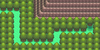
Screenshot of the layout of Spring Path in Diamond and Pearl from Bulbapedia
Screenshot of the layout of Spring Path in Platinum from Bulbapedia - the trees are more detailed
top: Diamond and Pearl — bottom: Platinum

Even Gen V, which was on the cusp of the core games' jump to full-on 3D graphics, took the next step in the complexities that sprite graphics could realize in the Pokémon mold:

A screenshot of player character Hilda on a bridge surrounded by cliffs and fog, a fence and a building. Also a hiker.Screenshot of player character Hilbert standing behind a Veteran near a bridge over a river on Route 10

Screenshot of player character Nate standing on a short bridge over a stream surrounded by fallen leaves and orange trees. God, Unova is beautifulScreenshot of player character Hilda standing by a pond of water on Route 8, with tree stumps emerging, surrounded by snowy trees

Screenshot of player character Hilda standing in front of the vista - a good look at Skyarrow Bridge as it extends into the distance (towards Castelia City)
visual splendor & epic sights of 2010/2012

Let's contrast Brilliant Diamond/Shining Pearl with the other remakes:

animated sprite of Ethan, panning right to Lyra, in their home town of New Bark, from the opening of HeartGold & SoulSilver - animated by chipsprites on tumblr
(this is technically a recreation by chipsprites on tumblr,
but it's pixel-perfect)

The first place to start would be the easy putt, comparing the Gen I games to its Gen III remakes. But we'll go a step further and also compare the Gen III remakes to the Let's Go, Pikachu! & Eevee! games that came out on the Nintendo Switch (so Gen VIII I guess? Sources say VII, and they came before Sword and Shield but, same system...) BD/SP will also be on the Switch; this segment is going to seem unfair to BD/SP, but only because a fair comparison reveals its lackluster. Let's take a look at the same plot of land in Viridian Forest:

screenshot of Viridian Forest from Generation I/Pokémon Red & Blue

Obviously there's a huge graphical and artistic leap between the Game Boy and the Game Boy Advance. Even Gen II to Gen III was a huge graphical overhaul that expanded the stylistic boundaries for realizing these worlds, because Gen II was fundamentally similar to Gen I.

screenshot of Viridian Forest from Pokémon FireRed & LeafGreen

The Game Boy Advance to the Switch is another obvious vertical leap. I haven't played Let's Go yet, (from what I understand some of the core mechanics are different, which isn't something I'm enthusiastic about,) but it makes the Kanto region look amazing, which is a triumph. To me, mostly because of its many iterations in more grid-based and low-res games, it hasn't been a very visually exciting region until recently.

screenshot of Viridian Forest from Pokémon Let's Go, Pikachu!

Let's take a deeper dive into a few Kanto landmarks that show off how the style has really evolved across the first four generations, in each of which Kanto makes an appearance. From the original games (Red/Green/Blue/Yellow) to the Gen II sequels (Gold/Silver/Crystal) into Gen III's remakes of the originals (Fire Red/Leaf Green) and then Gen IV's remakes of the Gen II games (HeartGold/SoulSilver.) Here is the first area of Victory Road, with images sourced from Bulbapedia:

screenshot of Victory Road Floor 1, from Generation I via Bulbapediascreenshot of Victory Road Floor 1, from Generation III via Bulbapedia
Gen I vs. Gen III

As you can see, the shape, on a grid level, is identical. The geography is perfectly replicated, but the graphics are more sophisticated and give a better sense of the textures and atmosphere of the terrain. It provides more character to the environment.

screenshot of Victory Road Floor 1, from Generation I via Bulbapediascreenshot of Victory Road Floor 1, from Generation II via Bulbapedia

Next, half-step back to look at Gen II: different grid structure, but same basic geography: that giant J is still the bulk of this floor. The main thing, improved mostly by the expanded color palette of the...Game Boy Color... is the atmosphere. The entrance looks light. The cave looks dark, feels cold.

screenshot of Victory Road Floor 1, from Generation III via Bulbapediascreenshot of Victory Road Floor 1, from Generation IV via Bulbapedia
(click the images to expand)

And finally, let's contrast them all with Gen IV. Here, you can see the J shape remains, but the whole ground has been revamped: there's a bridge, as height/depth is played with and there's more descent into the cavern than all previous iterations. It's got more atmosphere than Gen III while using more natural coloring than the more monochromatic/impressionistic Gen II look, but keeping that essence of being in a dark damp cave. The stairs on the right of the J still lead to a dead-end, but the Strength puzzle is up across the top of the ridge.

It does what a good remake should. It makes the room more vivacious and a lot larger, which is exciting design, because if you grew up with G/S/C, you were older/larger yourself by the time the remakes came along; by also giving the area in HG/SS a growth spurt, the designers are able to evoke a scale that matches what you remember. Because if you went back to play G/S/C, by virtue of the older graphics alone they would feel smaller than you remember. By scaling up for a remake, it reinvigorates the excitement (for returning fans, but it also, obviously, keeps things fresh for newcomers.) It realizes what the original, more-limited designs were dreaming they could evoke.

Screenshot of Pewter Museum in Generation I from Bulbapedia - It's a large two story building with a flat, doubled roof (one behind the other to make the building appear deeper) with small tiled slopes on the left and right sides, there's also a small two-story square building on the right sideScreenshot of Pewter Museum in Generation III from Bulbapedia - it's a complex, unique two-story building with a tiered pinkish-purple roof, a foyer that juts out as the main entrance, and a one-story wing building attached on the right side. There are bushes in front of the 6-pane glass windows, and columns run across the entire face of the building.
Gen I vs. Gen III

Let's also talk about this building; the Pewter City Museum of Science. As you can see, in Gen I it was as most other buildings were: simply-designed. It's just 'building, but big.' In Gen III, they designed a unique model to give it a specific fidelity. In fact, you could even infer what kind of building it is without the sign out front.

Screenshot of Pewter Museum in Generation II from Bulbapedia - a large two story building with a flat, doubled roof (one behind the other to make the building appear deeper) with small tiled slopes on the left and right sides, there's also a small two-story rectangular building on the right side. There are no doors on either building.Screenshot of Pewter Museum in Generation IV from Bulbapedia - a unique two-story building with a tiered pinkish roof, 8-pane windows across the first floor, a foyer that juts out as the main entrance, and a one-story wing building attached on the right side, but with no door. There are bushes in front of the building, and a short set of stairs leading to the foyer, as well as a suggested column design that runs across the entire face of the building.
Gen II vs. Gen IV

The Gen IV design is actually more a remake of Gen III's design than Gen II's; giving a consistency between FR/LG and HG/SS which also, yes, adds more realism through graphical design improvements like depth and shading, that were part of Gen IV's advanced capabilities.

Screenshot of Pewter Museum in Generation VII - The building is fully 3D, with windows on both stories of the main building. The side wing is still one-story, the bushes in front of the windows of the main building are much more detailed.

And then, naturally, they made it look even bigger and better-er for the Switch. Basically, the translation from 2D sprite overworlds to 3D, higher-definition overworlds we grew to expect was stuff like this:

screenshot of a portion of Fallarbor Town in Ruby & Sapphire from Bulbapedia. Cute sprite look, evoking a dusty town like in the American Southwest maybe.Screenshot of Brendan and May in Fallarbor Town, full 3D and full of life, more atmosphere; the same as in Gen III, just brought to life more


And of course:

screenshot of Mt. Moon entrance, Generation III from Bulbapediascreenshot of Mt. Moon entrance, Generation VII - There's a Meowth hanging out on top of the cave entrance

That's a reasonable expectation from where I sit! It looks the same, just bigger and richer. More alive.

Gif of the Pokémon Silver Version title screen, a shadowy sprite of Lugia swims across the bottom of the ocean, kicking up wet dust behind itGif of the Pokémon SoulSilver Version title screen, a 3D model of Lugia swims across the bottom of the ocean, kicking up wet dust behind it

screenshot of Route 101 in Hoenn from Gen IIIgif of Route 101 in Hoenn from Gen VI, Professor Birch being chased by Poochyena

The Ruby and Sapphire remakes are an idilic example of improving the "feel" of the environments, but keeping the general geometry and geography the same. Everything is laid out more or less the same, but scaled-up with an improved sense of verisimilitude to a lived-in world.

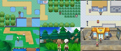
Side-by-side screenshots of 3 locations in both Ruby & Sapphire and Omega Ruby & Alpha Sapphire, showing how they were improved

It's more realistic, but I'll stress I'm not talking about realism. This series was never about pushing graphics or designs to hyper-realistic levels* like, say, Crysis (I think; I don't actually know anything about Crysis, my understanding is that it's more of a tech demo than a game you can buy or play.) Pokémon games are meant to be cartoonish and somewhat simplified, but you see what I mean. The graphics merely serve the aesthetics and art design. Which is why using the Switch's graphics on the Diamond and Pearl aesthetics and art design (for the overworld) in an exactingly duplicated way seems lazy, and is unexciting. 

screenshot of Brendan on the Acro Bike on Hoenn Route 119 North, Omega Ruby & Alpha Sapphire, beautiful river and verdant cliffs
this scenery just comes alive to me, it's unreal, but it evokes a lush, dynamic nature.
It's also much larger in proportion to the player character than in the original games.
Screenshot of Kalos Route 7, the player character Calem roller blades past a patch of flowers, a painter, and a castle on a river, to meet up with his friends
in Gen VI with X and Y, Game Freak utilized the Z-axis perspective
to add a [thematic and literal] depth to the breadth of the environment
screenshot from some route in Kanto in Pokémon Let's Go, Eevee!, I don't know I haven't played it yet I can't identify the route. I'm gonna guess Route 11?
Let's Go looks and feels in-line with the Gen VI games' overworld designs, while taking the graphical next-step. I realize I haven't even mentioned Gen VII's Alola games, so let's segue to some Gen VIII screenshots by showing some from Sun and Moon and/or Ultra Sun and Ultra Moon, because you can really see where Sword and Shield took the baton:

gif of player character Elio running up and around the hill on Alola Route 1 in Moon or Sun

screenshot of player character Selene in Professor Kukui's lab, looking at the aquarium with a Luvdisc in itscreenshot of player character Elio standing on an Alolan beach

screenshot of player character Selene standing outside of Wela Volcano park, the summit is visible from this anglescreenshot of player character Selene standing outside of some building and some ridges with wild grass, I don't know where, I haven't played these games enough

Gif of player character Elio running around the corner to go up the lusher, flower-er hill of Route 1, and a scene of him with the three starter Pokémon

As you can see, really pushing the vastness of the landscapes. Here's the world Sword and Shield built:

screenshot of Sword & Shield's Galar Route 1, player character Gloria looks out at the grassy terrain, and in the distance the town of Wedgehurst can be seen in full scope

screenshot of Galar Route 1, player character Gloria creeps through the tall grass

screenshot of player character Gloria standing in Wedgehurst, on a hilly road between some shops and the Pokémon Center

Screenshot of Sword & Shield without a player character: vista of a huge hill in Turffield with a geoglyph in the hillside, depicting something. I haven't played this far yet.

The Galar region looks stupendous. Seeing it made me indescribably jazzed at the mere concept of visiting a Sinnoh that looked like that. Instead, it's this:

Screenshot of player character Dawn running through the snow in Snowpoint City, from the Brilliant Diamond & Shining Pearl announcement trailer

Pokémon's core games are always "more of the same." But that's what I like about them. That's my opinion. To me, these games are about taking on similar adventures but in different regions with different Pokémon. I love that. A familiar routine that also has flexible variety; it's comforting and great. But this art style choice feels like "more of the same" in a stunted way, so I can't help but criticize. It reminds me too much of the originals' visuals. They didn't evolve.
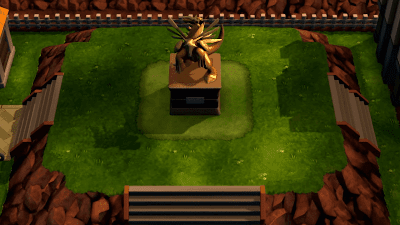
Screenshot of the Dialga/Palkia hybrid statue in Eterna City in Brilliant Diamond & Shining Pearl from the announcement trailer
(dat sunset lighting in Eterna City tho)

The Pokémon world is a reliable constant that satisfies something in me in a major way. And I know I'll still get that from the amazing in-battle vistas, the remade music, and yes, even the escapism from this weird 1:1 Tiny Overworld in BD/SP. I can feel it already starting to 'be gotten used to' as I'm writing this.

Like, really, it looks fine. It's not terribly underwhelming. But it is depressingly whelming. It should've been so much more. I should be marveling at a brand new rendition, achieved simply by copying of the aesthetics and scope of Sword and Shield. Every other remake matches the look of the other current-Gen games, and I guess I took that to be part of the 'promise' of remakes. But it's a different studio this time, so there was a different vision. And while I respect that...it feels like someone else doing a version of something, rather than a dev team revisiting and revitalizing terrain they've covered before. So it feels like a compromise.

And I know graphics are subject to change between any game's trailer and its release. That's how they fool ya. But it's not to the extent of a full art design overhaul. So it's still mostly-fair to critique.

Screenshot of the title card of the Pokémon Legends: Arceus announcement trailer - player character resembling Dawn stands in a field looking up at the massive Mount Coronet in the far distance

And speaking of incomplete trailer graphics full art design overhauls, Game Freak
is working on a different kind of game set in the Sinnoh region, Pokémon Legends: Arceus. Its trailer premiering right after the BD/SP trailer almost as a preemptive salve to offer what we would feel ILCA's game utterly lacks: it is more graphically in-line with the other recent core series games. But, there's a catch; it can't just be the same as BD/SP. So it's set in the past, centuries before the Pokémon world we are used to playing in.

Screenshot from Pokémon Legends: Arceus's announcement trailer - player character resembling Dawn runs through the main road in an ancient Japanese-style town with wood buildings towards a wooden gate with a bell in one tower

Fuck it, I'm in! That's an awesome concept! I love the world of Pokémon a bit more than my own; I'm very excited to get to see some of its history first-hand, and to get to wander the beauty of the Sinnoh region prior to human settlement. Shut up and take my money. No complaints about Legends: Arceus.

Screenshot from Pokémon Legends: Arceus's announcement trailer - player character resembling Lucas bends down on one knee to welcome an approaching Bidoof, in the middle of a wild prairie full of flowers

My only complaint about Legends: Arceus is that we didn't get Diamond and Pearl remakes from Game Freak tho. Why not give this one to another studio, or do this a few years after typical D/P remakes? But, at the end of the day, I'm glad this wasn't an 'either, or' scenario. I'm Eterna-lly grateful we're getting both.

Now, to do one last thing that's completely unfair, I'm going to share a fan-edited screenshot:

Side-by-side of a screenshot of Dawn from the trailers, in a full-body close-up in the overworld, untouched and official (left) and a version where someone has given her model some black, brushstroke outlines to make it look a lil better, kind of, and give definition to the shading already present in the original that kind of blahs together

It's one I've seen around the 'net that I can't find a source for, and whoever dash-slapped an article together over at Gamer Ant (I hope I'm parsing that right) couldn't be bothered to track down and source it themselves. And they presumably got paid for that shoddy work. (But that's par for the course in games journalism.)

Outlines are (presumably, what do I know) a kind of binary decision with 3D graphics: do you use them, or not? In this case, ILCA decided not to. Which is fine. You can make it work both ways. This speculative art-edit just kinda shows that, within the choice to do a 1:1 overworld, giving it an outline [whether brushstroke-style like the image, or not] helps change it, aesthetically, into something more different.

With prior gens, outlines were partly for clarity on the 3DS-level graphics in Gens VI and VII, but Sword and Shield still used them for a reason.

screenshot of a Vs. Trainer battle-intro scene in Sword and Shield, with the player character Gloria on the left and a Lass on the right, their figures are ever so slightly outlined
Not as pronounced, but still there!

Let's Go, however, doesn't use them. But this is the point where I cannot critique the footage from the BD/SP trailers. I can beef with the 1:1 overworld, because that's certainly set in stone. But the lighting and shading in the trailer may just be unfinished. Take a look at Koga in this screenshot from Let's Go

Screenshot of Gym Leader Koga, the ninja master, in Let's Go, Pikachu! & Eevee!, after being defeated - he says "Hmph! You have proven your worth!" and his model is shaded and lit well so outlines are not needed, IMO

And then look at a character model (Barry) from the BD/SP trailer:

screenshot from the BD/SP announcement trailer of Pokémon Trainer rival Barry, who has no outlines, and a weird shading and lighting that, for one thing, makes his face turn into a color that's somewhat indistinguishable from his hair, blending his face all peculiar
what's wrong with your face?

The shading and lighting looks weird. But that might just be unfinished. So it's not a worthy critique. Here's a side-by-side of Dawn from the trailer and official [i.e. finished] promotional artwork:

cropped screenshot of player character Dawn throwing a Poké Ball in battle, from the BD/SP announcement trailer - she looks weird because of the shading and lighting on her model, but it's not that bad I guessa cropped photo of player character Dawn from Bulbapedia, of official promotional artwork, where the lighting and shading is better because it (rather than outlines) properly defines her facial features and blends well across what is suggested as the 3D shape of her face

Again, kind of an unfair thing to compare, since promo art, even in the same artistic medium, will differ from the game. But she looks just fine in the art; the blending of the colors on her face show its shape better, without the need for outlines. I'll chalk this particular artistic oddity to "unfinished business."

You can't criticize a game effectively from its marketing material.  People seem to forget that in the knee-jerk responses to what they see in trailers. It's important to keep that in mind, folks. So it's not a matter of "outlines or no outlines." There is no one way that's "right" or "best." The style looks fine, even if that weird face-shading is final. My only gripe is with the overworld, and its scale.

image of a promotional poster for Pokémon Sun & Moon - a scene at a lush cliffside overlooking the Alolan beach, with a nice house and some people, kids, and a lot of Pokémon, including prominent Alolan Exeggutor

I have a hard time answering "which region is the most beautiful?" I can't pick favorites like that, I'd live in 'em all. But in my imagination I kinda think it's the Sinnoh region? It's the most like the climate I live in: with its winter, calm forests, fields and lakes. Although doing this screenshot deep-dive, I've really seen that, compared to the original D/P/Pt, the other regions have (since) fleshed out their splendor and beauty. Sinnoh's overworld isn't as pretty as I remember it, or picture it, in the actual games (as opposed to depictions in the anime or other official artworks.) But I know the potential for a more realized Sinnoh beauty is there. Since remakes had just become a thing a few short years before Diamond and Pearl, I've waited the longest to see them get remade. What would a freshly revamped Sinnoh look like?

And we're kinda getting that in Legends: Arceus, but that's a different era. I wanted remakes of Diamond and Pearl to blow my mind the way Omega Ruby and Alpha Sapphire did. Like HeartGold and SoulSilver did (whose art style made a compelling argument that Johto is the most beautiful region. It even has winter, calm forests, fields and lakes.)

A gorgeous promotional artwork of Ecruteak City for Pokémon HeartGold & SoulSilver by Midori Harada, depicting a gorgeous sunset with the autumn foliage surrounding this old style town, the Burned Tower and Bell Tower. Also visible in the distance is Mt. Mortar, Mahogany Town, the Lake of Rage, and the massive snowy mountain that sits on Route 44 and contains Ice Path

At the end of the day, It's just an awkward bummer. Like banging your funny bone, it feels strange but that feeling will fade. Brilliant Diamond and Shining Pearl and Pokémon Legends: Arceus should serve us all of my -- our -- Sinnoh Region Remake needs. I just really wanted ice cream cake. Not ice cream and cake.

side-by-side screenshots of the player characters in Brilliant Diamond/Shining Pearl (left) and Let's Go, Eevee! (right) in the middle of tall grass in a forest area flanked by trees. Suffice it to say that the Let's Go screenshot has a bigger, beefier atmosphere and ambience, while the BD/SP scene is a 1:1 3D version of the original games
[source]
That's all it boils down to.


*Although Detective Pikachu was decently well-balanced in that respect, and while I'm on the subject, I'd love two dozen sequels that are more or less "It's a ____ movie but with Pokémon."

No comments:

Post a Comment